
Winamp 5.5 Beta
 Bet you never even noticed the link over on the right for Winamp. I don't just do it for health or money (neither comes my way); I link to it because I actually feel it's a superior program for listening to one's music files. It's gone through some changes and additions over the years (including a much hated acquisition by AOL and an equally hated version 3), but continues to provide great functionality.
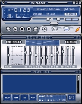
The latest alteration to come for some time has now arrived in the form of version 5.5. It's been a while since there's been a brand new default skin (their last change: "Modern", is just ok), but "Bento" cometh. It includes great changes/fixes (ye olde style song "ticker", an EQ that doesn't show only bass), but what's notable about it is that the developers has gone full-on into making an interface that's akin to other modern players. In other words, it's big, big, BIG.
Winamp's past skins have featured detachable parts, but Bento has all the pieces incorporated. You get the player itself, the playlist editor, a large area which holds the Media Library/Visualization Studio/browser, and a new area which (by default) shows album art (about time!) and detailed track information. And try as I might, I cannot remove/hide this new area. I also can't detach any of the pieces and reassemble them. I can hide the playlist, but it just fills that area with the new area. This is the best I can make it look. And yes, the word is "Bento is a SingleUI skin", so separate components won't be possible if you want to use any of its new spiffiness.
This drove me crazy at first, because I liked to keep my Winamp always visible, at its minimum configuration (only the player itself showing), in the lower-right of my screen. I could pop-up the playlist when I needed it, which would appear to the left of the player itself.
In its new form, even though I've got it as small as I'm willing to go, Winamp just takes up too much room. This bugged me for quite some time, but since I like the new album art feature, I came up with a compromise. I keep it centered in the bottom-middle, and use the "windowshade" mode and docking property to minimize it to a small sliver at the bottom of the screen when it's taking up too much real estate. Check it out. Not too shabby.
In conclusion, I like Winamp 5.5's functionality, and think they did a great job with the look of the new skin. But if you're like me, and you liked Winamp's previous GUI behavior, you're likely going to have to adapt a bit and start using some of the new features they've put in throughout the years.
posted by Hollow Man at 5:18 PM
![]()
![]()


1 Comments:
Hey, thanks for the preview! Saw your link to the blog from the Relic forums.
Post a Comment
<< Home